One thing I’ve been toying with is how to visualize what I write about “sharpness” in lens tests in a way that would make it more understandable. This is a way trickier problem than it at first seems, and at some point I have to favor simplification over accuracy.
First up, “sharpness” in the context of my reviews tends to speak to three things simultaneously: MTF values, sagittal/meriodonal contrast, and acuity. So let’s start there.
MTF testing is pretty easy to do. In its simplest form, you just need a razor sharp black/white diagonal edge to photograph and the right software to interpret it (I usually use Imatest, though I’ve played with a few other tools, as well). Most lens reviewers on the Web who post “numbers” for particular apertures of a lens for center, mid-area, and corner are showing you the values they attained from some form of chart testing, often in graph form.
The problem with numbers is that they’re not really comparable. Pixel count, color filtration pattern (and the demosaic used), chart type, chart distance, how “hard” the edges in the chart are, and a host of other factors just make it impossible to say Number X is better than Number Y if all you have are the two numbers from different testers. The graphs, do, however, tend to show you the performance change of a lens as you stop down reasonably well.
Nor do the numbers really speak to differences in sagittal/meriodonal capability. Sagittal is resolving ability on the diagonal from the center to corner of a frame, while meriodonal measurements are 90° to that. Both values are useful to know, as they suggest spherical aberration or coma issues if not equal. Moreover, some lenses are really good at low frequency line measurement for these attributes, but much poorer for high frequency line measurement (the 10 lppm versus 30 lppm you usually see in manufacturer’s theoretical charts).
Then we have a not oft talked attribute I actually worry about most: edge acuity. It’s easiest to explain in the Foveon versus Bayer comparisons, as Foveon has full color data for every pixel, where Bayer has to interpret two of the color values for every pixel. A bad Bayer demosaic can provide good color but have a negative impact on the integrity of the thinnest recordable “lines” (loss of acuity). Noise, noise reduction, lens corrections, and a host of other factors can impact acuity. If you tested at high ISO values, for instance, the MTF, sagittal, meriodonal, and acuity is affected.
Yikes. And I’m oversimplifying here.
What I want to do is simplify even more! ;~)
Right now it tends to take me a couple of dense paragraphs to describe what I see in the results of my chart testing as well as IRL (in real life) use. I counting on you to visualize that, and I know from the questions I get that many of you can’t.
Herbert Keppler at Popular Photography eventually settled on a little colored grid, which worked decently, but that grid doesn’t do quite what I want.
To me, the big thing you want to know about is what’s the lens best capability, and what happens to that as you move further from the center of the lens.
Assuming the lens maker got their manufacturing correct, the center is the best possible result from an optical standpoint. If it wasn’t made right, you would immediately see left/right and perhaps top/bottom differences (left/right is the longer axis, and easier to see a difference on). Light not deflected in any way (center axis of lens) shouldn’t be degraded other than perhaps some glass/air reflections (loss of light), for which lens makers use special coatings to control these days.
Corners these days are the opposite. Beyond using aspherically-polished elements to change how the light diffracts as you move from the center, every lens maker these days relies on lens corrections to do some of the work these days. For linear distortion, that means doing calculations on corner data and creating new pixels introduces potential interaction effects. One lens I recently worked with, had good sagittal but bad meridional attributes. When you use the data that lens produces to change the linear distortion with lens corrections, you end up with a clear directional smear in the pixels. Ugh.
I’m going to continue to use the dense word descriptions I’ve been using, but I wanted a better way for you to quickly “parse” what I might be saying. So here it is:
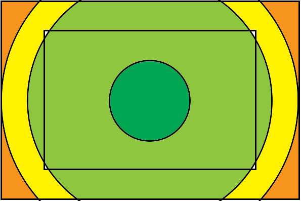
- Green = Excellent or better
- Lighter Green = Very Good to Excellent-
- Yellow = Good
- Orange = Fair
- Red = Poor
There may be some circle areas I show with a graduated color, particularly in the DX image area, where I’ve found a few lenses that have variability in across that broad area.
The lens the above graphic shows is excellent in the center, very good to excellent- out through the DX corners (which generally includes a circle that goes outside the DX frame in the middle), good in the frame edge to frame edge area (long axis), and fair in the corners. Green is what you’re looking for; I doubt you’d have concerns about the green areas of any lens. (I’d tend to say this example shows a good lens, but not a great one that clearly distinguishes itself from the pack, as it has that corner falloff that doesn’t allow it to reach edge to edge acuity.) I’ll try to show such graphics in my review from wide open, the best aperture, and the start of the diffraction impacted apertures. Generally, as you stop down, a lens should get “greener” ;~).
The quick way to read these charts is that red is bad, orange is less bad, yellow is okay (or meh ;~), greens are good. I'll only include three charts for a focal length for a reason. On the high pixel count cameras (and high pixel density APS-C cameras), once we move to an aperture smaller than f/8 it gets near impossible to distinguish reduction its resolving capability from just simple diffraction. I don’t know of a modern lens that does better at f/11 than at f/8 in terms of MTF, contrast, and acuity on modern high resolution cameras. Thus I'll end my quick visual charts at the aperture that diffraction starts to be the primary impact: the colors aren’t going to get better after that, in my experience.
For full frame lenses, I’ll show the outer boundary (full frame, duh), and the inner APS-C/DX crop boundary (inner rectangle). For APS-C/DX lenses, I’ll use the same circles/sizes, but omit the inner frame boundary in the graphic. One thing you should note is that the APS-C/DX image circle (not the frame) incorporates the usual rule of third points.
So to make it really simple: you’re looking for the “most green” (broadest area of greens) if you’re comparing two lenses. Any orange or red you see should make you pause to think whether that’s going to impact your images.
So what do you think? I haven’t deployed this graphic in any review yet, but I’m strongly considering doing so. Do you feel it’s useful?
——
Some of you are probably still asking for numbers. Again, numbers prove to be a big issue, particularly over time as image sensors change, and don’t give you a simplified sense of how the lens is performing. The urge to compare numbers will almost certainly get you into trouble in some way, and most people put too much weight into differences in values that might only generate minor visual change. Moreover, you wouldn’t be able to compare my numbers to anyone else’s, but I’ll bet you would ;~).
I believe I’ve earned a reputation for being consistent with my wording about how well a lens performs over the years. When I write a lens performs “excellent” (green) it’s living large in the optimal data range. It’s been rare, though not unheard of, that sensor resolution improvements have led me to re-judge a lens, and when I do I simply update my review with what I currently see with an optimal camera/sensor.
